UX DESIGN CASE STUDY
Website Redesign for the Oregon Department of Justice
Streamlining five government division websites into one coherent online presence.
Industry sector: Government

Oregon DOJ website: overview and goals
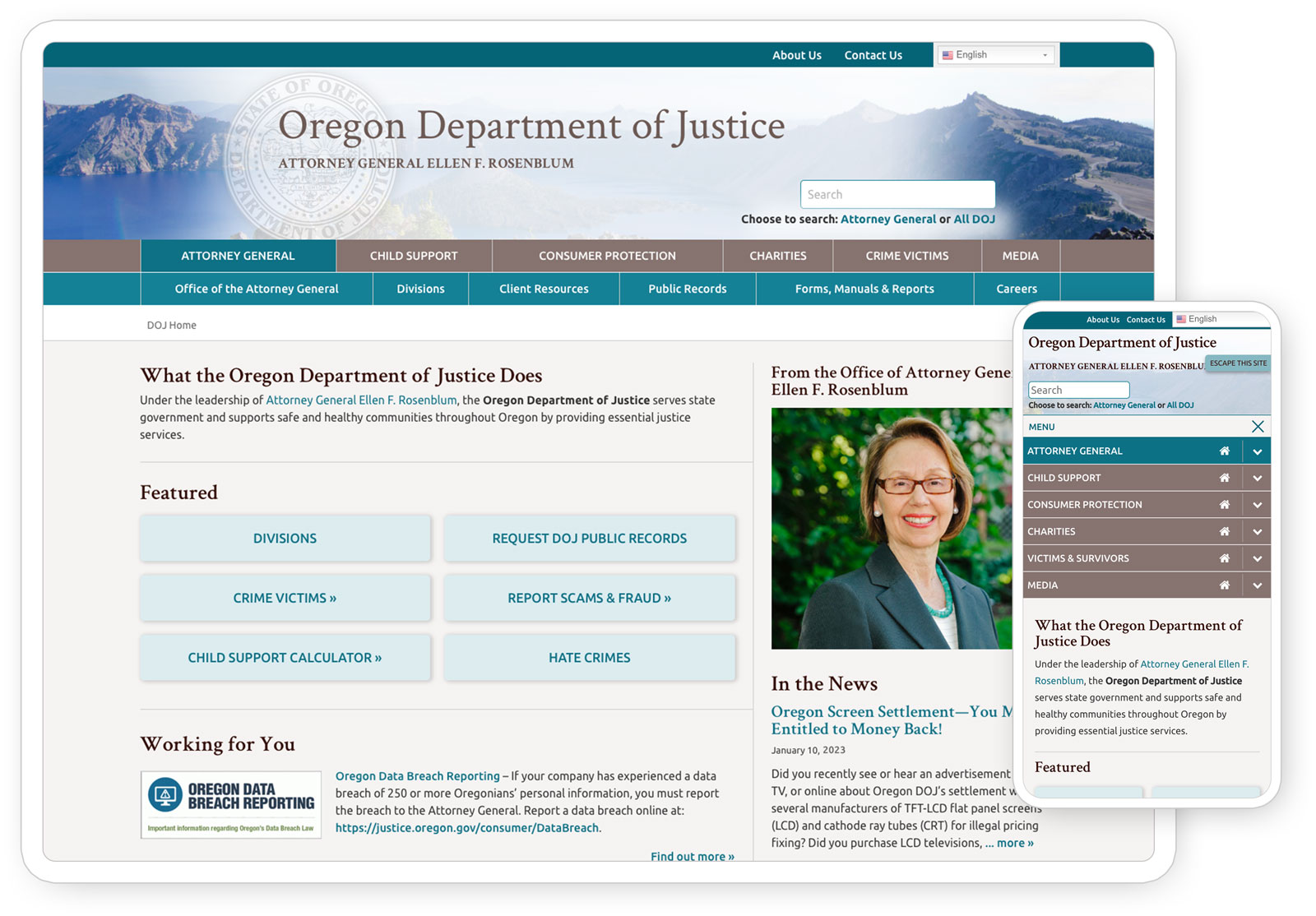
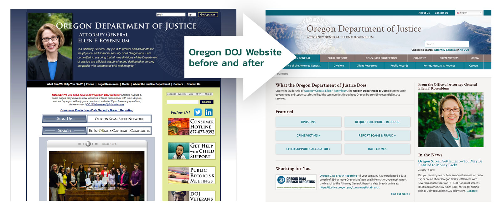
At Gard, I redesigned the Oregon Department of Justice (DOJ) website, integrating five separate division websites (Consumer Protection, Child Support, Crime Victims, Charitable Activities, and the Office of the Attorney General) that had been built individually in SharePoint into one, fully responsive website in WordPress.
This overhaul aimed to simplify the online experience for Oregonians and highlight the Attorney General’s priorities.
DOJ website challenges
The various DOJ division websites were difficult for the DOJ to manage and lacked cohesion, with each site having its own visual design and tone of voice. The division websites had grown without a plan, and users had trouble finding information crucial to their needs. Gard was tasked with creating a unified and user-friendly online experience to serve all Oregonians.

DOJ website: key actions
Discovery: Engaged stakeholders from various divisions (Office of the Attorney General, Child Support, Consumer Protection, Charitable Activities, and Crime Victims’ Services) to understand their needs.
Information Architecture: Completely restructured the content to integrate five websites into one cohesive experience. A sixth section serving the media was also added.
UX Design: Redesigned to better serve diverse audiences across the spectrum of Oregonians that use the DOJ’s resources and services.
Usability Testing: Included at multiple stages to understand audience needs and validate UX decisions.
Content: Collaborated with DOJ staff to rewrite and streamline content across hundreds of pages, cutting volume by half and making content easier to find and more user-friendly to read.
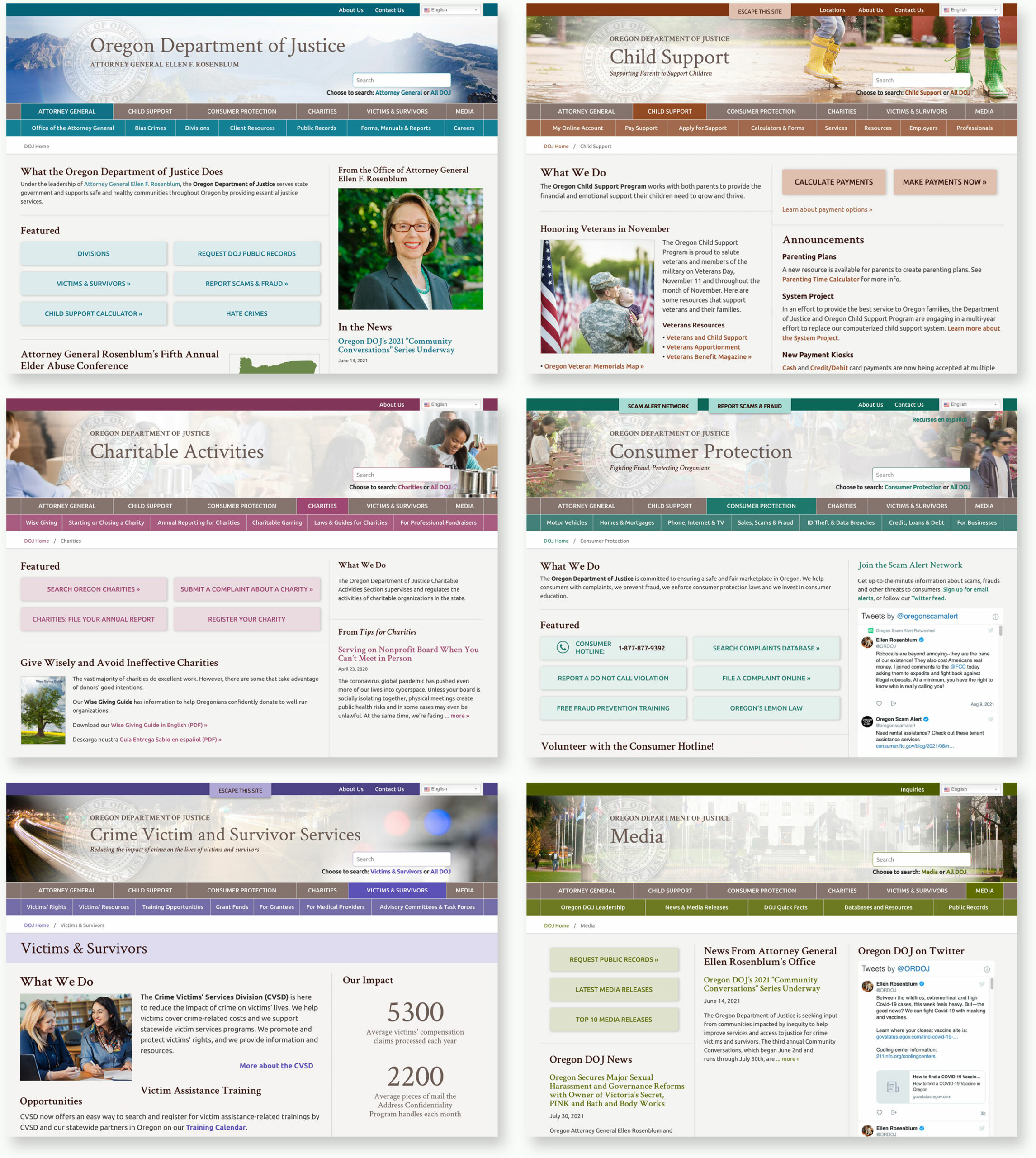
Visual Design: Developed a new design that allows each division sub-site to maintain color-coded visual distinction while adhering to a unified look and feel.
Navigation: Created a unique navigation solution for mobile users.
Functionality: Designed custom maps, widgets, wizards, search solutions and translation integration.
Training: Provided thorough CMS training for 12 content editors, and ongoing knowledge transfer to two senior administrators.

User research and usability testing
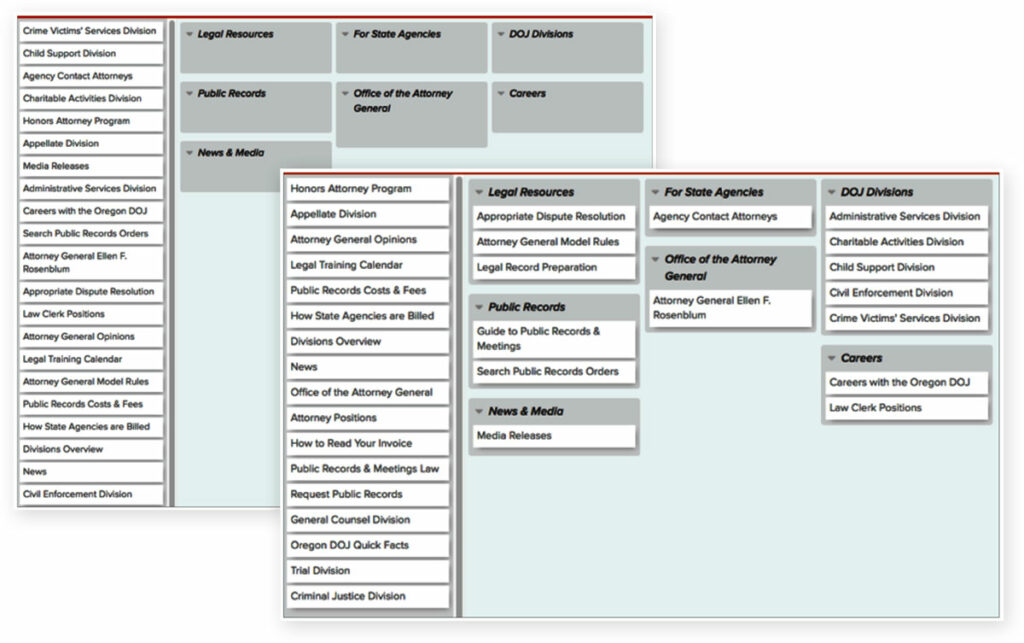
The image shows two screens from an online card sort test for the Attorney General’s sub-site, to ascertain how users would naturally arrange the content to fit their own mental models.
DOJ website results
The new Oregon Department of Justice website presents the Oregon DOJ as a unified entity that serves all Oregonians, positioning it as a leader in state government stewardship.
Awards
The new Oregon DOJ website won a “Best Overall” WAGGY award and a Silver w3 award in the Government category.

Explore more
An overview of selected UX design projects I have led to completion.
Get in touch!
Looking forward to hearing from you 😊