UX DESIGN CASE STUDY
Enhancing Document Collection in Driveway.com’s Purchase Flow
Working with a cross-functional team to craft solutions that improve the vehicle purchase flow and increase operational efficiency.
Challenge
Driveway.com enables customers to purchase vehicles online and have them delivered from anywhere in the country. While most of the process is digital, legal requirements like driver’s license and insurance verification traditionally happened during a post-purchase customer care call.
Our goal was to move document collection earlier in the process to empower customers and improve operational efficiency, while carefully integrating these new steps into an already complex checkout flow.
Discovery and strategy
I began by analyzing existing document upload patterns on the site to identify reusable components. Through feasibility discussions with engineers, we decided to pace the upload request after order submission to protect the time-sensitive cart process and avoid introducing friction before purchase.
I brought early lo-fi wireframes to a day-long workshop with engineers and systems architects during which we hashed out the nature of the problem and solutions, the edge cases and the Product Requirements Document. Further iterations of the wireframes reflected cross-functional team feedback that helped me refine the flow. Placement and messaging concepts were discussed with representatives of the customer care team to help align the draft content with their pain points.
Another key limitation surfaced – the CRM system that consumed the uploaded files couldn’t provide specific feedback to the user about those files. This led us to develop more generic success messaging while ensuring users remained confident about their submissions.

Design solutions
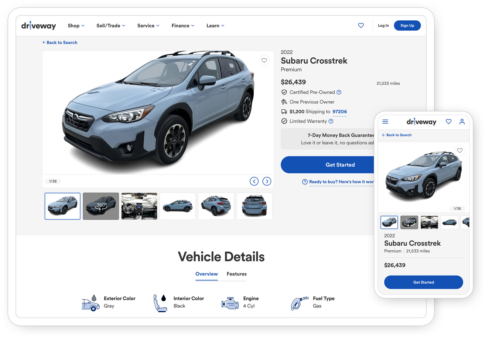
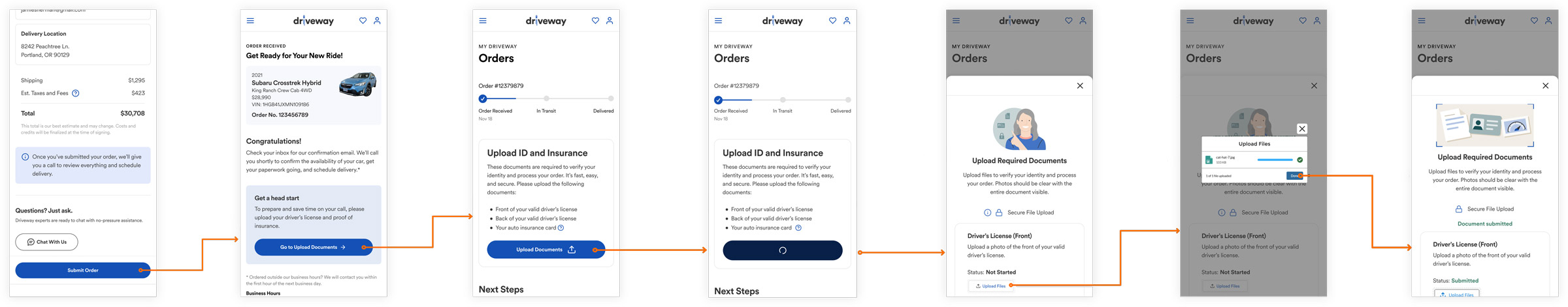
My solution introduced document upload touchpoints across seven key screens in the purchase flow:
• Order Submission confirmation
• Order Received messaging
• Enhanced My Orders dashboard
• Streamlined Document Upload modal
• Upload Progress indication
• Status confirmation
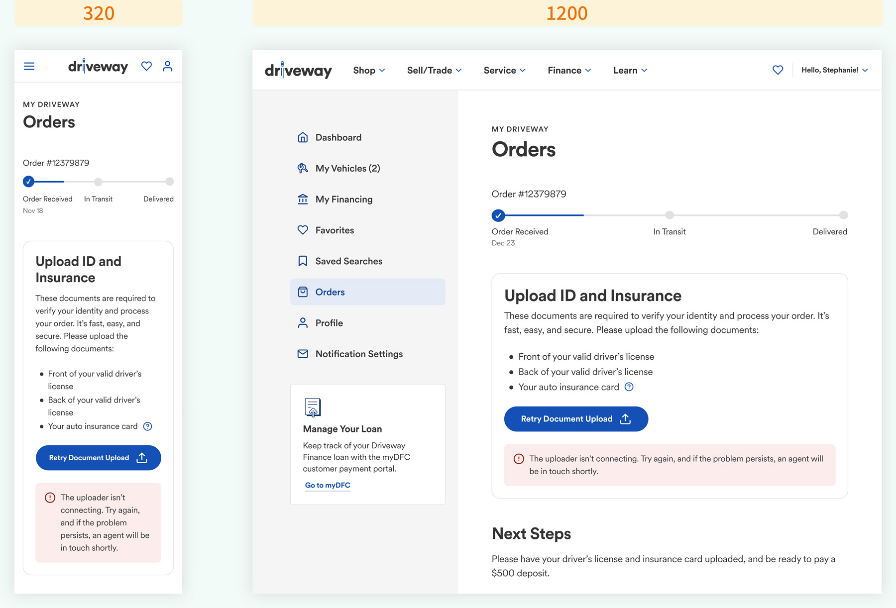
• Updated Orders view
While existing upload flows had dedicated screens, this feature needed to work within the busier My Orders page. I enhanced visibility through strategic use of color and typography while maintaining design system consistency, pressure-testing each screen across six breakpoints to ensuring the new elements arranged elegantly at every viewport size.
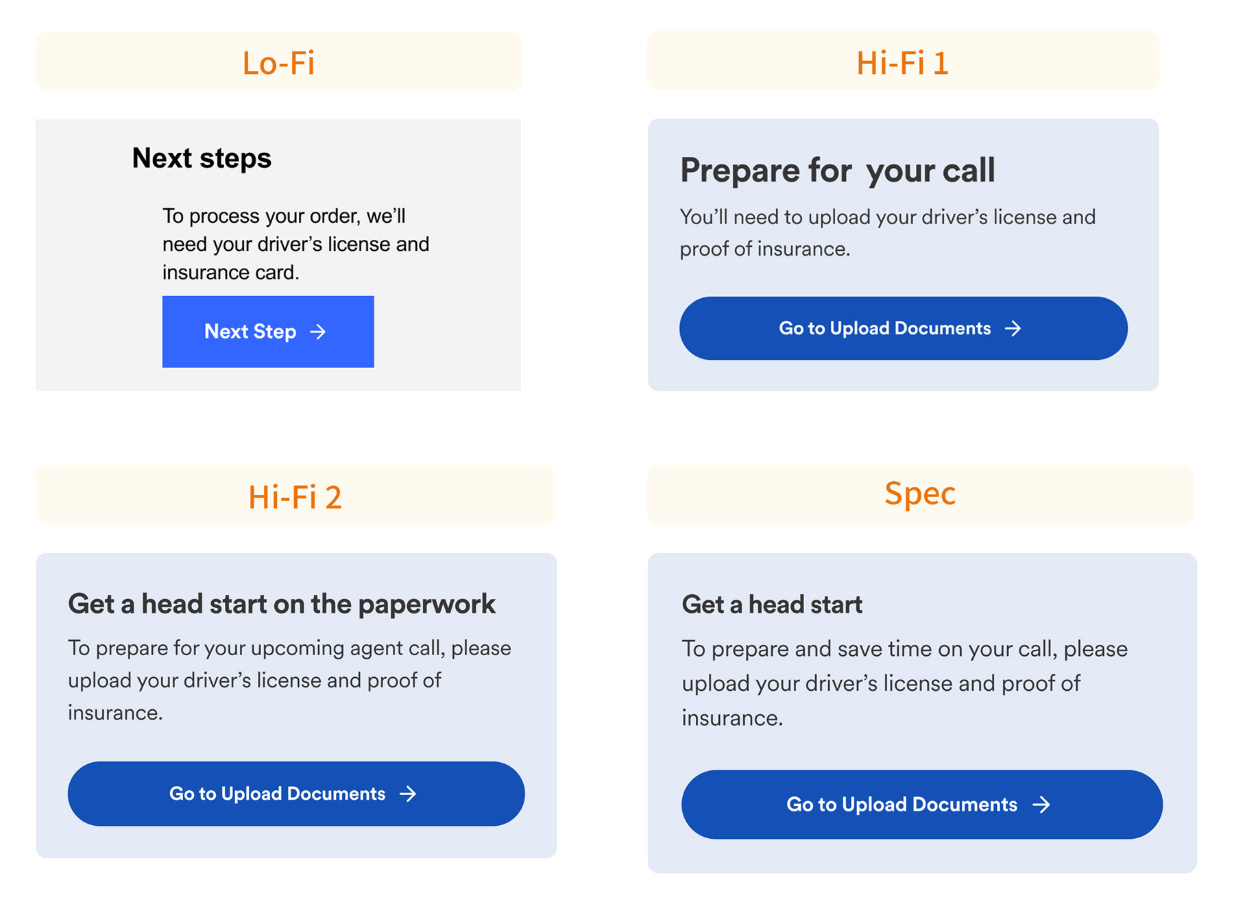
Content evolution
Content evolved through collaboration with the UX team. For example, we shifted upload messaging from “Prepare for your call…” to “Get a head start…” to better emphasize user benefit.
The upload interface itself needed to serve multiple scenarios, including agent-initiated requests for document resubmission, leading to carefully crafted flexible messaging.
Impact
The enhancement successfully streamlined the purchase process while improving operational efficiency:
• Users stay engaged during the wait for their agent call
• Reduced cognitive load for both users and agents
• Agents expect increased user preparedness and commitment
• Carefully crafted error messaging ensures users aren’t blocked if they encounter difficulties
Explore more
An overview of selected UX design projects I have led to completion.
Get in touch!
Looking forward to hearing from you 😊